Types of Wizard Templates
Flexmail includes 11ready-to-use templates in the Wizard editor. Every template is built around a common email use case. Each mobile-responsive template can be recognised by it's name and thumbnail. Here's an overview of what each template includes.
Available wizard templates
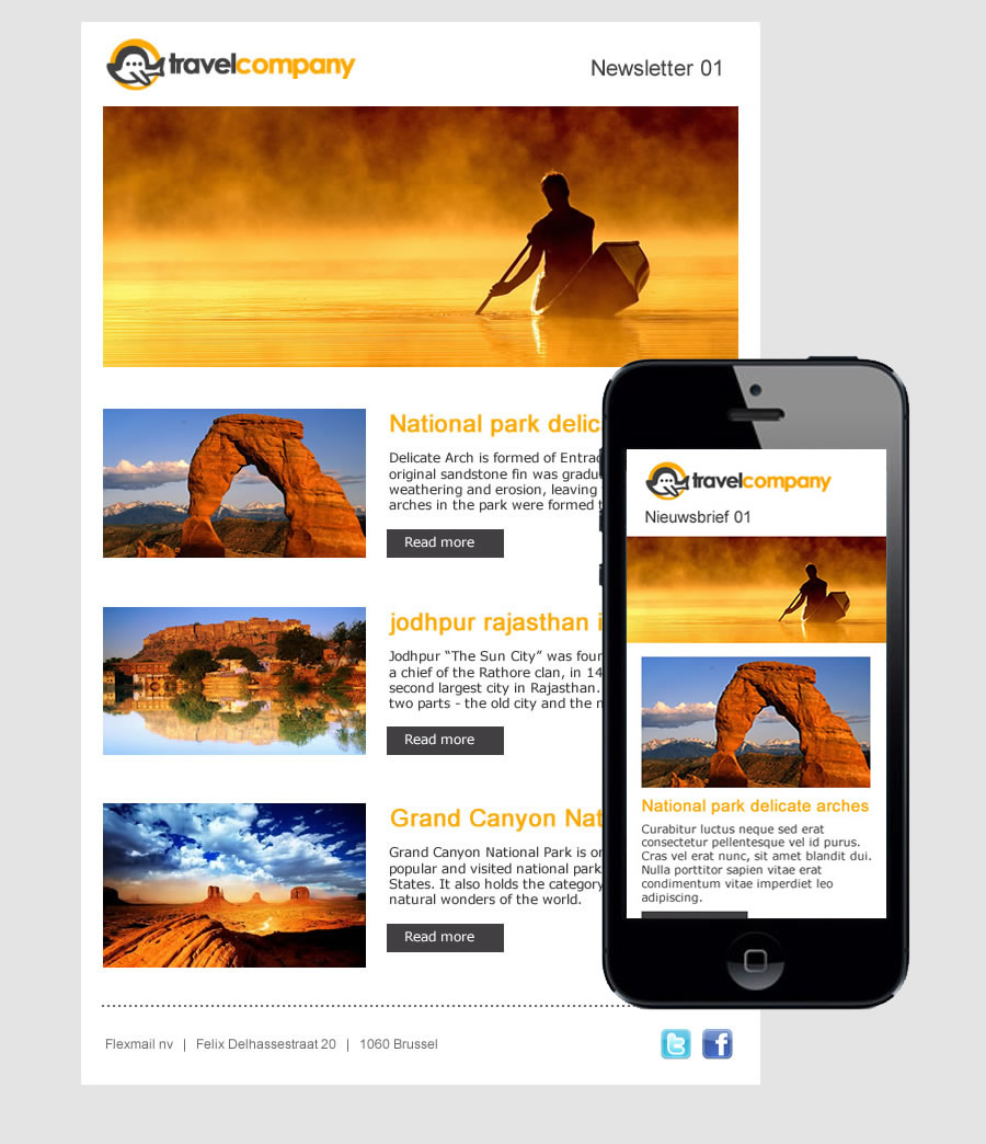
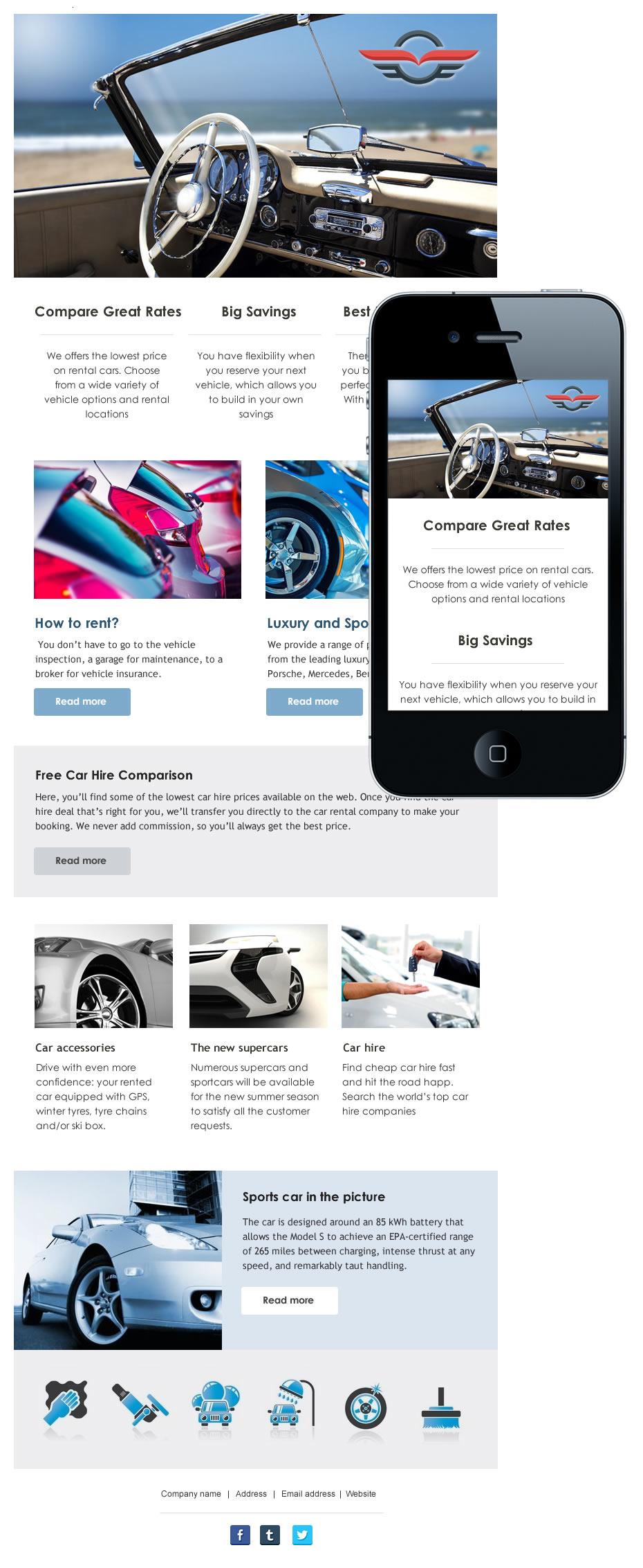
Mobile - 1
Suited for multi-article newsletters featuring a large hero image or banner.
Includes:
- Header with logo and e-mail title
- Hero image / banner
- Articles with a thumbnail, title and CTA each
- Footer with company name, address and social media icons
Mobile - 2
Good for content-rich newsletters where the banner leads visually. The templates allows for two visually distinct featured articles with CTA.
Includes:
- Hero image / banner
- Logo and Social media icons
- Featured articles with large thumbnail, titles and CTA
- Secondary articles with smaller thumbnails and a text link CTA
- Footer with company name, address

Mobile - 3
Clean and flexible, minimal distractions, works for many content types.
Includes:
- Header with logo and e-mail title
- Banner / hero image
- 3 columns, feature with title and thumbnail
- Articles with thumbnail, title and CTA
- Footer with company name, address and social media icons

Mobile - 4
Like Mobile-1, but with more emphasis on social media.
Includes:
- Header with logo
- Banner or hero image
- E-mail title and social media icons
- Articles with thumbnails, title and and a chevron right as CTA
- Footer with company name and address

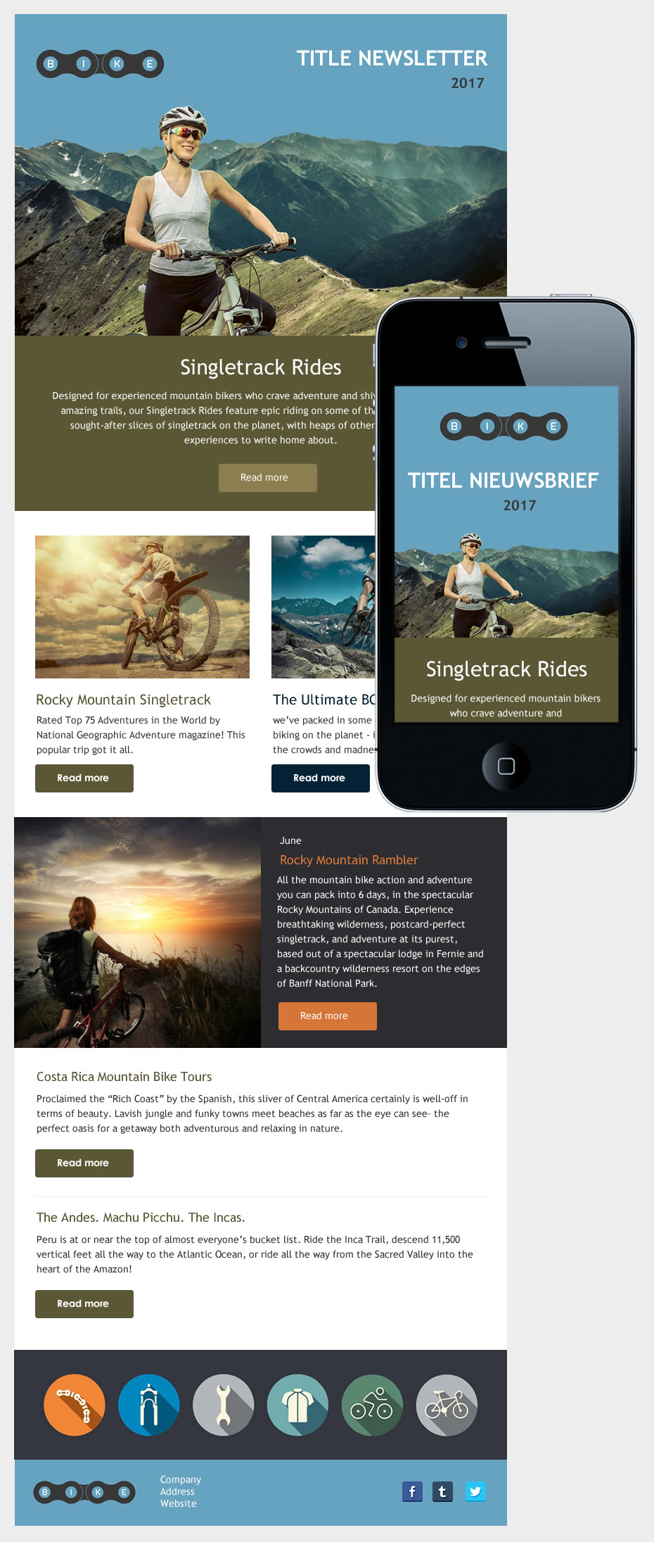
Mobile - 5
Like Mobile-3, with addition of an activity section and call to action section.
Includes:
- Header with logo
- Main article with hero image, large title and clear CTA
- Banner / full width image
- Call to action section
- 3 columns, featured items with thumbnail, title and CTA
- Calendar / activities section
- Articles with thumbnail, title and CTA
- Footer with company name, address and social media icons
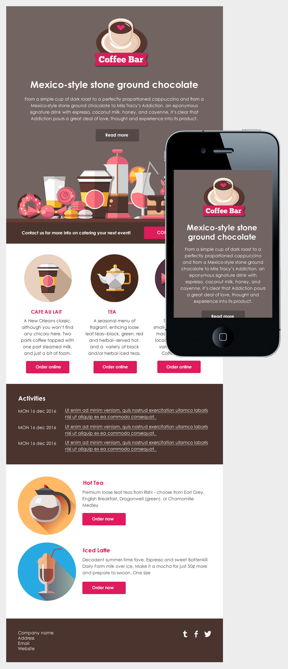
Mobile - 6
Good for product or catalogue emails where two items sit side by side or an item is featured.
Includes:
- Header with logo and title
- Main article with full width hero image, title and CTA
- 2 columns, article with large thumbnail, title and CTA
- Spotlight article with title, CTA and 50% width thumbnail on the left or right
- Articles with thumbnail, title and CTA
- 6 icons row
- Footer with company name, address, email, website and social icons
Mobile - 7
Works well for showcasing a collection of products or event photos.
Includes:
- Main article with full width hero image, title and CTA
- Call to action bar before articles
- Article with title, CTA and 50% width thumbnail on the left or right
- Call to action bar after articles
- 3 x 2 image grid
- 2 columns, article with large thumbnail, title and CTA
- Footer with company name, address, email, website and social icons
Mobile - 8
Similar to Mobile-6 with a banner-first layout and a three column section.
Includes:
- Hero image
- 3 columns, features with title and CTA
- 2 columns, article with large thumbnail, title and CTA
- Articles with thumbnail, title and CTA
- 3 columns, article with thumbnail, title and CTA
- Spotlight article with title, CTA and 33% width thumbnail on the left or right
- 6 icons row
- Footer with company name, address, email, website and social icons
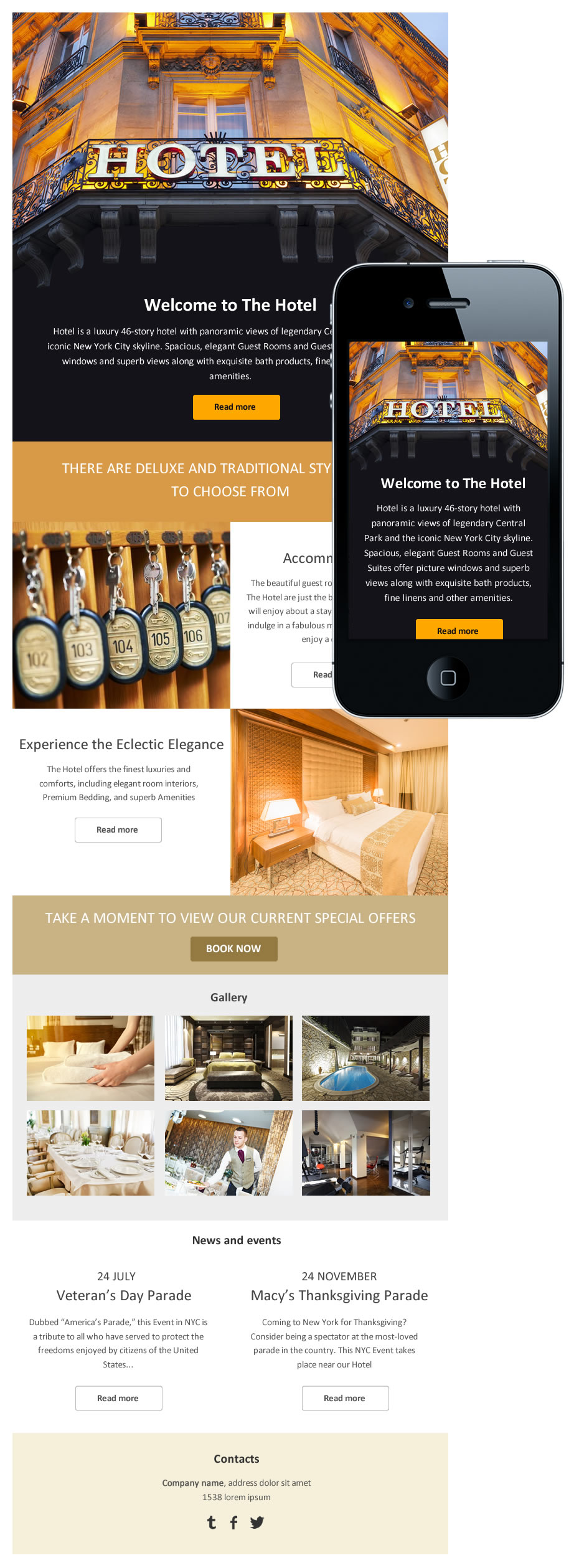
Template - 2
A multi article desktop template with an introductory and closing text.
Includes:
- header with hero image / banner, date and E-mail title
- Introduction
- Articles with title, thumbnail and text link CTA
- Closing text
- Footer with banner, company name, address, email and website

Template - 3
A simple, single column design suited for long-form text content or internal communications.
Includes:
- Header with banner image, date and e-mail title
- Full width article
- Footer with company name, address, phone, fax, email and website

Template - 4
A multi article desktop template featuring a side bar with a table of content and room for sponsor banners.
Includes:
- Header with e-mail title and hero image / banner
- Main area with:
- Introduction
- Articles with thumbnail, title and text link CTA
- Closing text
- Aside with:
- Date
- Table of contents
- Mini banners
- Footer with company name, address, phone, fax, email and website
Choosing the right template
- For multi-article newsletters: Mobile-1, Mobile-2, Mobile-3 or Mobile-4.
- For single-topic focused emails: Mobile-5, Mobile-6, or Mobile-7.
- For product or catalogue emails: Mobile-6 or Mobile-7.
- For plain text or simple announcements: Template-3.
- For social and brand-forward emails: Mobile-2 of Mobile-4.
If no template fits
If none of the available templates match your needs, you have two options: switch to the Email builder, which gives you full layout control, or contact sales@flexmail.be to have a custom Wizard template created for your brand.
Next steps
- See "Get started with the Wizard template" for what the Wizard supports and a step-by-step creation walkthrough.
- See "Configure your branding in Wizard templates" for making the Wizard template fit your brand.
- If you need dynamic content or custom layouts, see "Get started with the Email builder".