Add a call to action (button)
A call to action (CTA) button is one of the most important elements in a marketing email. It directs readers to take a specific next step, visiting a page, registering for an event, downloading a file, or claiming an offer. A well-designed button stands out visually and makes the desired action obvious.
E-mail builder
- In the Elements panel on the left, find the Button element.
-
Drag it onto the canvas into a structure column.
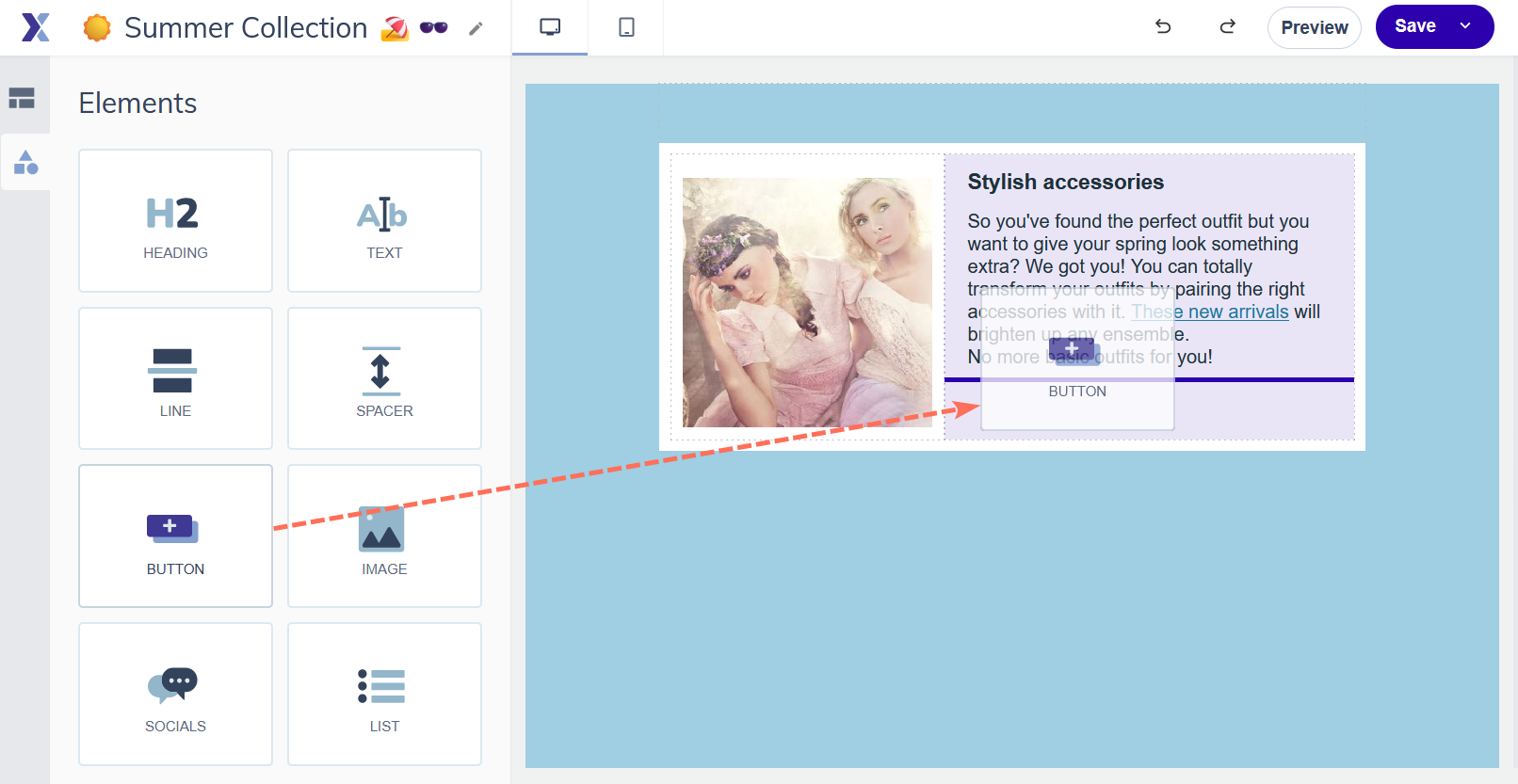
- Click the button on the canvas to open its settings.
- Enter the button label, keep it short and action-oriented. Examples: "Register now", "Download the guide", "View the offer".
- In the right panel, add a link with the destination URL or select the link type.
- Below that you can adjust the button style: background colour, text colour, font, padding, border radius, and alignment.


Support tip Use a button colour and button background colour that contrasts clearly with your content background colour. Your Brand kit colours are a good starting point; verify that there is enough contrast between the button, its text, and the background behind it.
Wizard Template
- Add or edit an article
- Scroll down to the CTA section
- Enter the button text (link name) and the destination URL. Use the icons next the the link field to switch your link type.
Depending on the chosen template, you’ll either find settings to change the individual button’s colours or can set the button colours globally at the bottom of the template in the Layout section.

HTML Editor
The HTML editor does not have a dedicated button element. To create a button-style CTA you can use the HTML source view to add a styled table-based button, or upload an image of a button and add a link to it. For proper styled buttons without writing HTML, the Email builder is the more practical choice.
Writing effective CTA text
- Start with a verb, "Download", "Register", "View", "Get started".
- "View the autumn collection" outperforms "Click here", specificity drives higher click rates.
- Keep it short, aim for 2 to 5 words.
- Match the button text to what happens on the destination page. Don't promise "Download now" if the link leads to a product page.
Pro tips
- One primary CTA per email performs better than multiple competing buttons. If you need secondary links, use text links rather than additional buttons.
- Place your primary CTA above the fold where possible, readers should see it without scrolling.
- In the Email builder, use the mobile preview to confirm your button is large enough to tap comfortably on a small screen. A minimum total height of 44px is a good target.
Common mistakes to avoid
- Vague button text like "Click here" or "Learn more", these give the reader no reason to click. Always describe the action and outcome.
- Using a button colour too similar to the email background. Low contrast buttons get missed, especially on mobile.
- Too many CTA buttons competing for attention. Prioritise one clear primary action per email.
Next steps
- See "Add a link" for all available link types you can assign to a button.
- See "Link tracking" for how to track button clicks in your campaign reports.
- See "Functional vs. emotional links" in Best practices for guidance on CTA strategy.